Designing for Real People: Lessons from 4 Web Audits
(Spoiler: It’s all about accessibility)
We’ve spent the past year deep in discovery, conducting web audits across industries like education, healthcare, tech, and responsible resource development.
Different audiences. Different platforms. One massive throughline:
Designing for your audience is designing for accessibility.
Accessibility isn’t just colour contrast and alt text (although, yes—do those things). It’s about creating digital spaces where your audience can actually understand, trust, and act.
Here’s what we’ve learned:
1. Rural users need lightweight sites.
Project: Casino Mining (Coming soon)
Many of Casino’s stakeholders live in remote Yukon communities. That means slow internet, limited data, and brief sessions.
Design Fix:
No animation. Minimal media. Printable resources.
We designed the site to load fast and communicate clearly, because if your audience can’t access your message, it doesn’t matter how beautiful it is.

2. If your audience is global, your language needs to be local.
Project: York University School of Continuing Studies
For many students, English isn’t a first language, and navigating university systems online is hard enough. The site was packed with academic jargon, long-winded copy, and hidden info.
Design Fix:
Plain language. Short sentences. Consistent formatting.
We suggested content for grade 1 English levels, using visuals and scannable patterns to support ESL learners. Accessibility here = equity.
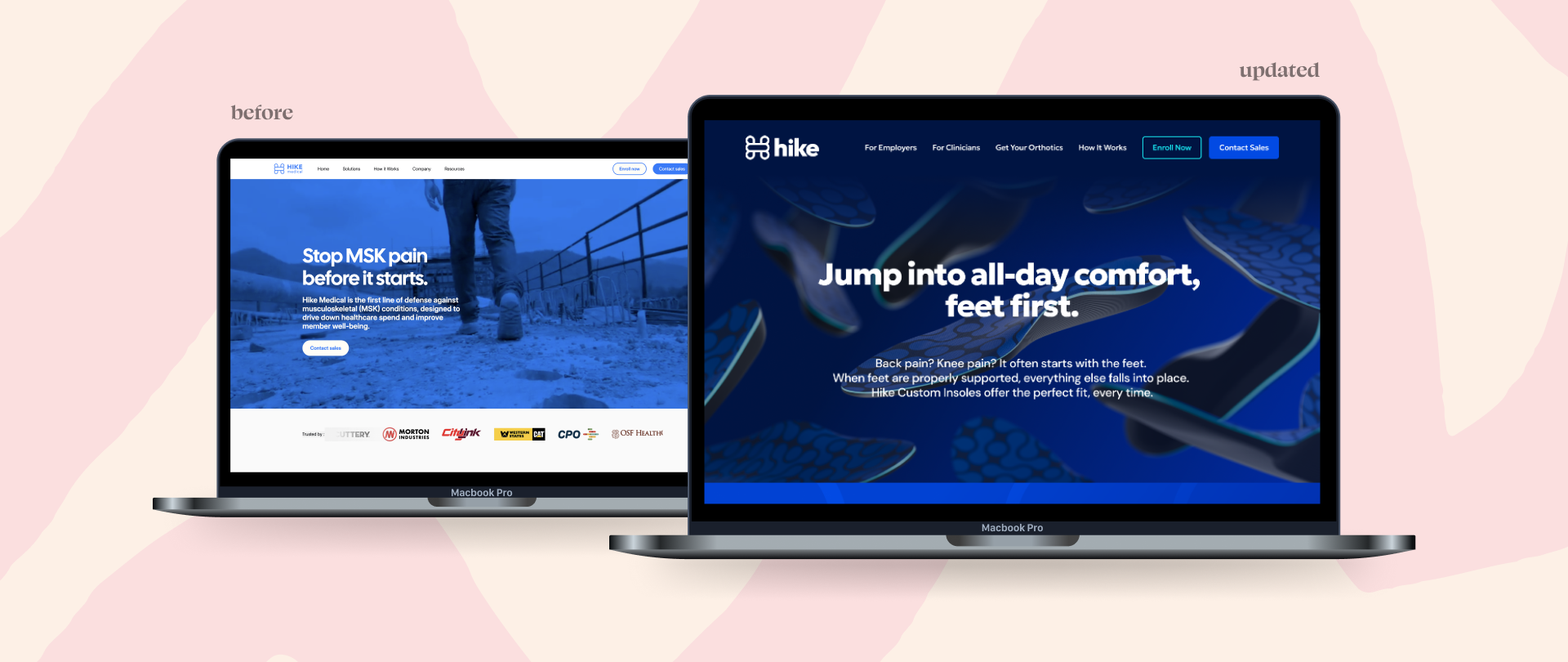
3. Simplifying your message is an act of empathy.
Project: Hike Medical (Coming soon)
Before we got involved, Hike’s content was jumbled. Great ideas, but no structure. Users were overwhelmed and unsure where to click.
Design Fix:
Clear hierarchy. Focused entry points. Specific CTAs.
We treated the homepage like a movie trailer—just enough info to intrigue, with intuitive paths for those who wanted more.
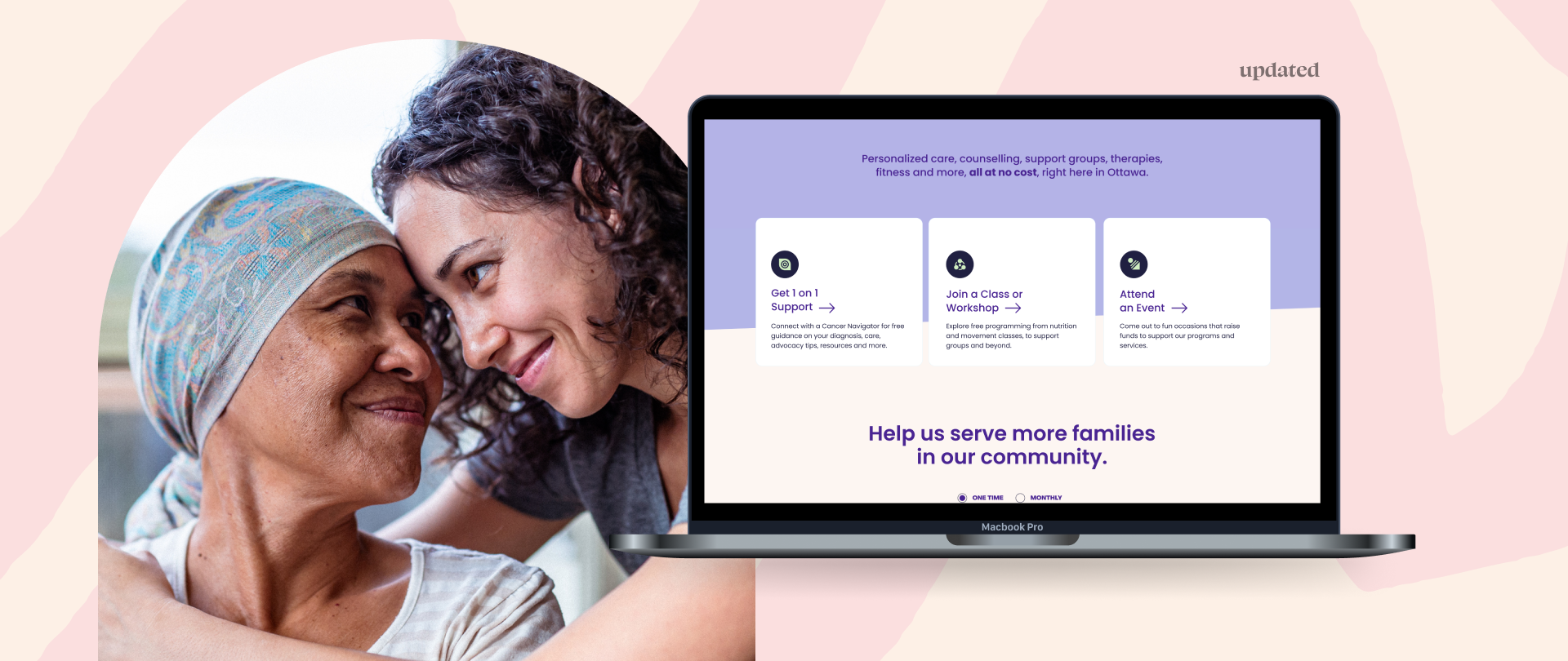
4. When people are under stress, clarity is care.
Project: Healthcare nonprofits
We’ve worked with several organizations supporting people during some of life’s hardest moments. In those cases, the website can’t afford to confuse or overwhelm.
Design Fix:
Calming visuals. Clear choices. Gentle, encouraging tone.
This is where accessibility moves beyond compliance. It becomes an expression of care, and your brand’s quiet promise to meet people with respect.
5. If you're trying to talk to everyone, you're serving no one.
Across all our audits, we saw the same trap: vague navigation, hidden CTAs, and unclear user journeys.
Design Fix:
Role-based pages. Audience-first content. Bold, purposeful CTAs.
Your website isn’t just a brochure. It’s a tool. And if you want it to work? It needs to be clear, fast, and built for the people using it.
Accessibility isn’t the cherry on top. It’s the whole damn cake.
When we design websites that reflect real user needs—whether that means slow-loading connections, multilingual audiences, or moments of emotional overwhelm—we’re not just being “inclusive.”
We’re being effective.
👉 Want to know how your site stacks up? Ask us about our BOLD Health Check™.
