Your Brand Isn’t Reaching Who You Think It Is
The Gap Between Good Intentions and Real Inclusion
A lot of brands think they’re inclusive.
They’ve got a rainbow in the footer, a stock photo of “diversity,” and maybe even a paragraph on their values page about belonging. But then we look closer. The fonts are tiny. The messaging is vague. The experience is built for... well, someone else. It’s not that you don’t care.It’s that the way you’re showing up doesn’t match the people you say you’re here for.
Inclusion Is More Than Intention
If your brand serves older adults, but your website uses tiny grey text and assumes tech fluency, you’re not accessible. If your product is rooted in women’s health, but your brand visuals still reflect male-gaze beauty standards, you’re not speaking to her. If your mission is equity, but your site still defaults to academic English, western norms, or clinical coldness, you’re not as inclusive as you think.
We’ve seen it again and again across industries—from healthcare to education to wellness.
What This Looks Like IRL
The Doctress’ Office
What they do: Empathy led healthcare practice, serving women.
What we did: We built a brand identity that’s intelligent, inclusive, and avoids “femtech pink” tropes—because women deserve care that doesn’t feel infantilizing.

Psychedelics Today
What they do: Focuses on rigorous education in a field filled with stigma.
What we did: We helped shape a brand system that signals seriousness and accessibility, without falling into “woo-woo” visuals or academic elitism.

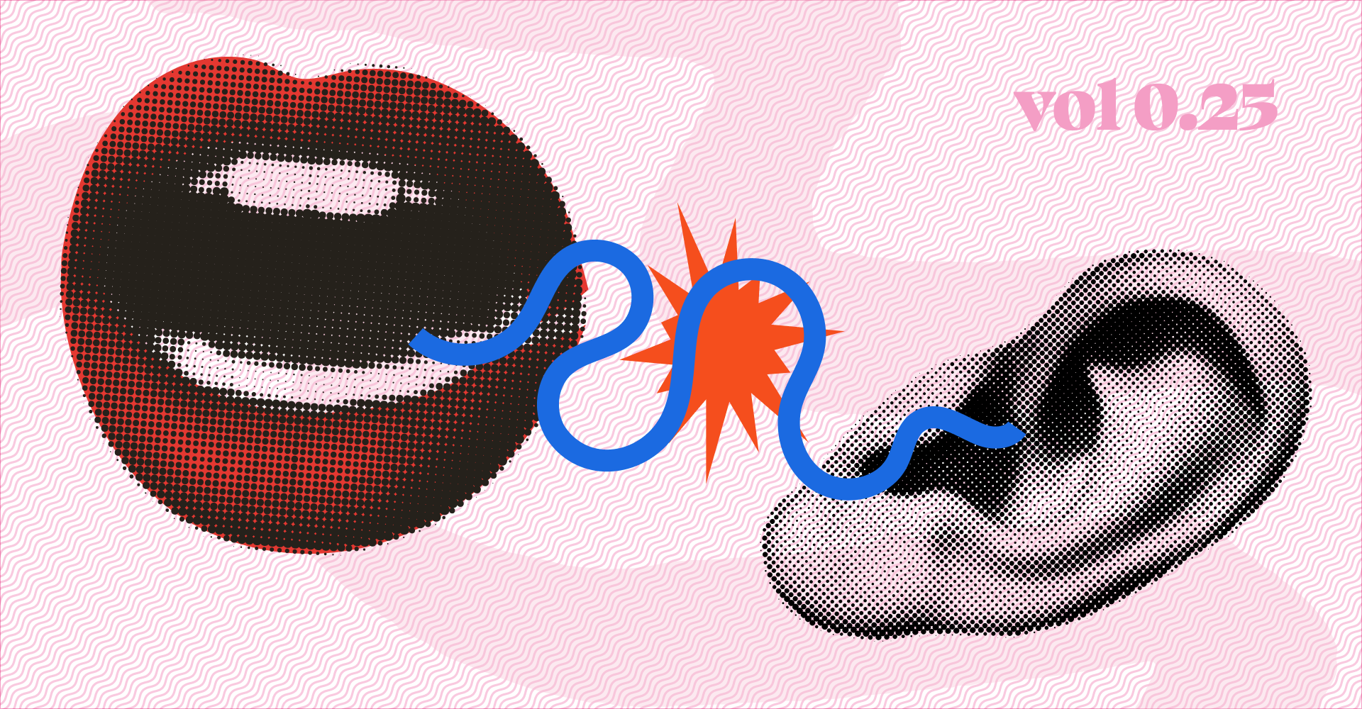
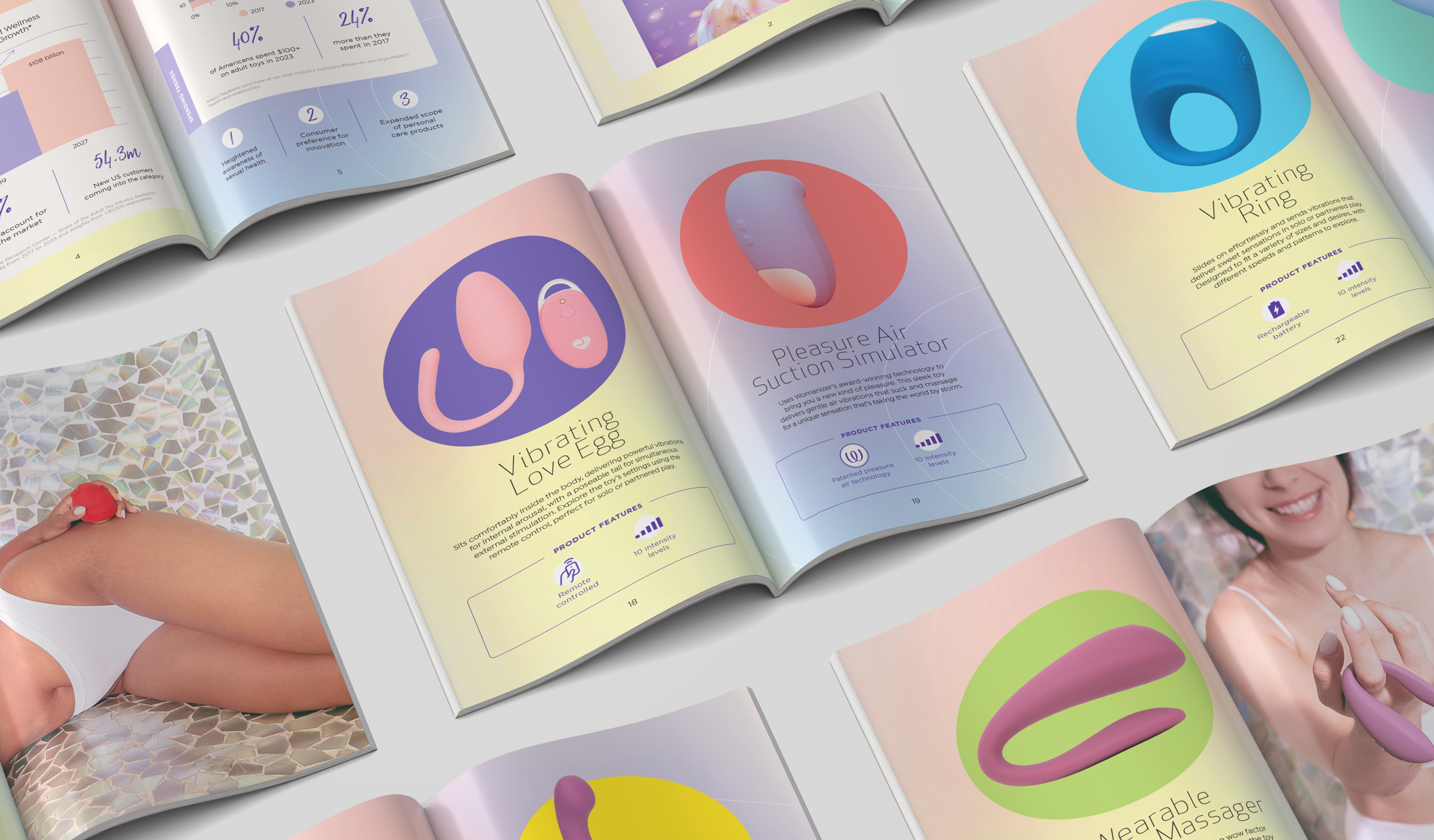
Lovehoney | Mon Ami
What they do: Erotic gifts to promote sexual happiness and wellbeing.
What we did: We developed a B2B sales tool for their sex toy line, shifting the tone from playful retail to a more polished, buyer-focused approach—keeping it professional and discreet without losing the fun.
BuildAble
What they do: Nurse-led, home renovations for accessibility and aging in place.
What we did: Our work with them prioritized simple, large-print layouts and messaging that respects independence and dignity. Accessibility wasn’t a feature. It was the whole premise.

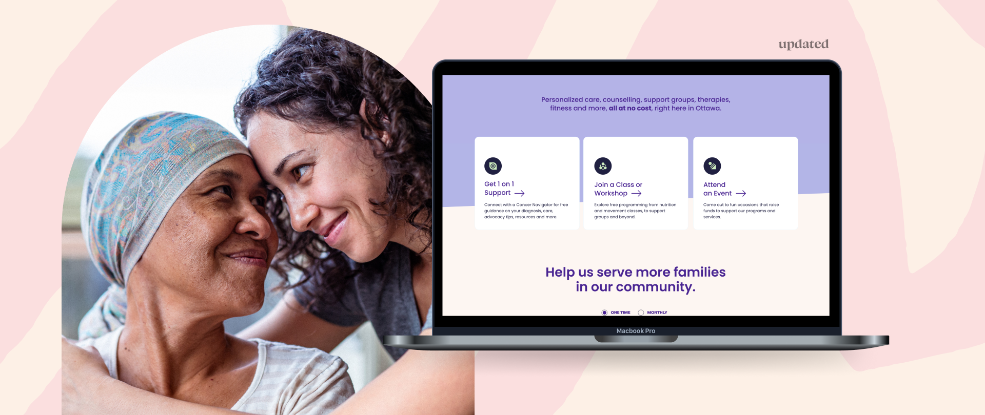
Ottawa Cancer Foundation
What they do: Supports people who are often navigating grief, fear, and major life changes.
What we did: When we audited their site, we considered every design choice with compassion: fewer choices, gentle pacing, quiet clarity.
The Real Cost of the Disconnect
When there’s a gap between what your brand wants to be and how it actually shows up, you lose trust. You lose connection. And yes—you lose customers.
Because your audience is smart. They feel the disconnect.
And they move on.
Brand Inclusion Is Brand Strategy
This isn’t about being politically correct. It’s about being understood. It’s about creating clarity, safety, and connection through every design and messaging choice.
When you show up in ways that make people feel seen, respected, and included, you grow.
Not just in size. In value.
Want to Close the Gap?
We’ve helped healthcare, education, home design, and wellness brands align their messaging and design with their values—and the communities they want to serve.
👉 Reach out for a free 15-minute consult.
